Bug fixing and improvements to Forms. We’ve made it quicker for changes to the Homepage to be live for visitors to see.
We’ve made it quicker for changes to the Homepage to be live for visitors to see.
During the summer we’ve taken time out to fix some of the bugs in the ChurchDesk Homepage as well as implementing some enhancements on ChurchDesk Forms.
Homepage
We’ve made it quicker for changes to the Homepage to be live for visitors to see.
For a long time any changes made to the Homepage have had a delay of 1-2 hours before they would be made public. This would prevent any mistakes made to the Homepage being seen publicly by visitors, as well as allowing users to test for a while, as the changes were only immediately visible to logged in users. We realise, however, that this might be too long and have therefore made it possible for you to force the update through.
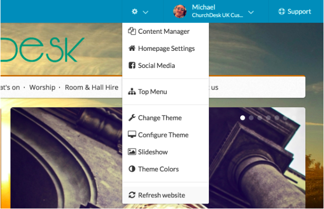
Simply go to settings in the top right menu and click “Refresh website”.
 Click "Refresh website" to force an update of your Homepage changes
Also, if you update an event from a ChurchDesk Calendar that appears on your website, the delay has been lowered to only 10 minutes. As with Homepage changes, it is possible to force an update by clicking the “Refresh website” button.
Finally, we have cleared some of the bugs that have been reported for Theme 6 on the Homepage. This includes fixing:
- The main menu on tablet - It wasn’t possible to tap on submenus on tablet, so we are now showing the mobile menu on tablet as well.
- Slideshow - Since we weren’t indicating the max height for slideshows some found it difficult to make their images look good in slideshows. We have therefore added a recommended height (500px).
- Theme 6 on mobile - We had issues making blog posts responsive, meaning that it didn’t look great on mobile.
Forms
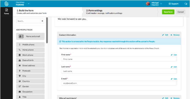
It’s been very exciting to see how quickly forms have been created, shared, and responded to. Since we launched ChurchDesk Forms we’ve received lots of positive feedback as well as feature requests. Some of the feedback told us that some of the fields needed for the form were difficult to find and drag in, especially on longer and more complex forms, since the available fields were following the page scroll. We have therefore moved the available fields to the left of the screen with its own scroll bar. This has made it easier to drag as well as find the fields you need.
 Search for the field you need and drag it from left to right
We appreciate any feedback
We are constantly working to improve Forms, and will soon make the integration between ChurchDesk People and Forms even stronger. So, if you’ve got suggestions for improving this great feature, please don’t hesitate to let us know - we’d love to hear from you!
