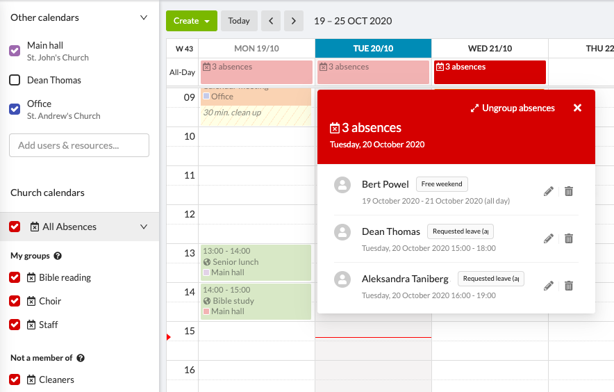
We are always working to improve our already great calendar for you. Today, we are adding a new view for absences so your daily view becomes less cluttered.
Show all absences and save space at the same time
Running a busy church means having a busy calendar that’s hard to read at a glance. To make it easier for you, absences can now be grouped to make more space for your primary events. To know who’s absent, simply click on the grouped absences. Also, if needed, you can choose to show or hide all absences – in a single click – or only show absences for users in specific groups.
New absence icons and other updates to the calendar
- The absence icon is now a crossed-out calendar icon to cover all types of absences at once.
- The pop-up for booking conflicts has been improved to make it easier to see which users or resources are already booked.
- The calendar filters have been improved to ensure that selected filters are saved correctly for when you open the calendar again.
- The colour contrast for prep- and clean up time has been enhanced to improve accessibility.
Remember that we’re here to help
When you start using new functionalities, questions tend to arise. We encourage you to reach out to us via support@churchdesk.com if you have any questions!
